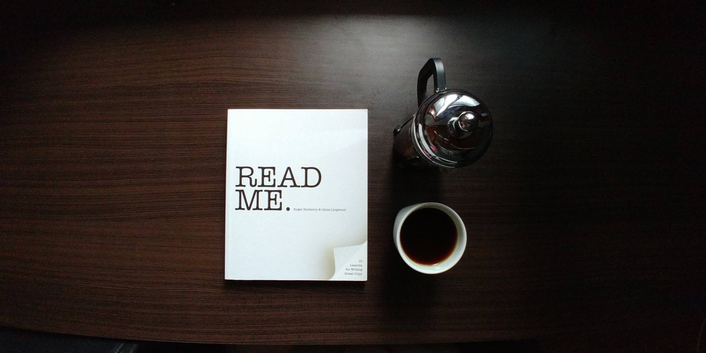

Please read me:
How to get people who don’t like reading to read your writing.

The problem: People don’t have the perceived time, the patience or maybe even the eyesight to read lots of text in an interface. My problem: I am the UX writer on the UX team full of brilliant strategists and designers. Currently I am a consulting UX writer at an outstanding global brand. The challenge with writing for a brand like this is twofold: there is a well-loved, well-established tone of voice, which has to be adhered to, even in micro interactions. Plus the copy I write will be translated into 40+ languages. Said global brand’s design is eye-catching, logical and well-tuned to the needs of the user. My writing is meant to be all of that too.
“But people don’t want to read”
“The tests show that they are not reading.”
Sigh.
I hear this all the time.
I regroup. I reassess. I A/B test different words in different configurations. But then I rethink the situation with the kind of user empathy that befits a proper UX communications designer. In this context, the audience are USERS, not readers. They are not here to read a book or an article. They are here to use an app or a software for a transaction, for an interaction. So, what’s the common word? Action. Right.
I need to take action. And as a person who believes in adaptation, I bend, scrunch and wrinkle the road so that it rises to meet me. So here are my Darwinistic UX writing adaptations to get people to read my words on your interface.
1 Kinetic typography
Words that move, literally, and hopefully figuratively speaking too. There’s now a bit of After Effects animation used in interface design. Words can fade. Call to action buttons can pop or grow when clicked. On-boarding instructions can grow or shrink. The possibilities are endless, and the technology is not terribly complicated to add into an interaction.
2 Data visualisations storytelling
People love infographics. And a picture is worth a thousand words. Now how about moderating your copy with colour, well-chosen fonts, and illustration that elevates your words? Yanko Tsvetkov’s hilarious (and not necessarily PC) Atlas of Prejudice has drawn the attention of many readers who probably do not generally enjoy reading maps. Why else read a map if you’re not going anyplace in particular? Because the words are short, well-placed and sharply funny. One advantage a UX writer has over a regular copywriter is that she is writing for a hyperlinked, interconnected, interactive media. If your copy could use an interdimensional boost, by all means give it one! 3 Unlock the treasure and follow your wise old sherpaIf users think they’re being led to a treasure, they will read your writing. In pop-culture, a common trope is a wise and kind guide (think Gandalf or Yoda) who shows up to save you Deus ex Dumbledore style by giving you crucial information at a critical intersection. People read maps or complex riddles if they think it will lead them to triumph. People will read your writing if they think it will lead them to a reward, be it information or valuable help. 4 Listacles (List + articles = listacles)Why is Buzzfeed the best? Because everyone has time to read a listacle. Users can digest more information if it’s in bite-sized pieces. I mean the 10 Commandments was the very first listacle and that’s still trotted out millennia onwards. And um, what is this that you’re reading right now, huh?5 Interactive quizzesEveryone likes talking about themselves, even if they don’t admit it. Basically, what interactive quizzes do is disclose information progressively, and filter user journey paths. You’ll speak to your user more effectively if you understand who they are, what specifically they want and where they wish to be led. So those are my top 5 tips on how to get unwilling readers to read your interface copy. And you’re still reading, right? Well, do you see what I just did there?


